8 Jan 2010
Draft Chapter (Food & Drink)
I’d love to get your feedback on a draft chapter for a possible book to accompany the archive. If this gets published then it will help raise funds to support the ongoing work of the History of Advertising Trust in this area. As usual please leave comments below or get in touch.
NB. The images used are only an edited selection of those that would eventually accompany the text. I’m less interested in thoughts on the pictures and most keen for feedback on the text.
Thanks,
Sam
1. Food & Drink
Food & drink is the largest category of surviving signs and, among these, those for bread and bakers, in particular Hovis, are hugely dominant. Other basic supplies such as dairy products, groceries, meat and tea also feature heavily.
1.1 Butcher, baker, candlestick maker
The majority of food & drink signs can be found on premises which at some time made or sold the products being advertised (and in some cases they still do). This is evidence of a time before the dominance of supermarkets offering a single location to purchase everything you might need, when shopping would have typically involved visiting different outlets selling the various foodstuffs required: bakers; butchers; grocers; tea houses. A time when you knew your local shopkeepers’ names rather than reading them off a name badge at the checkout.
1.2 Shop local
The 2006 ‘Shop Local’ project by artist Bob and Roberta Smith tackled this change, challenging the dominance of big retail by creating hand painted signs for local businesses in Hoxton, London. The pamphlet that accompanied the project offered up these sobering words from the Small Shops Group:
“Wafer thin margins, combined with the constant threat of unfair competition from supermarket behemoths, mean that small shops, once an essential part of the fabric of rural and urban life, are disappearing in their thousands each year.”

2. Flour & bread
2.1 Flour for bakers
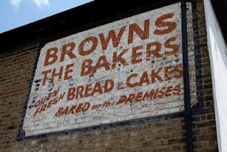
Hovis and its one-time competitors Daren, Golden Harvest and Whitton’s had their signs painted on the bakers’ shops where bread and other baked goods made from their flour could be bought, sometimes accompanied by tea. These brands were aiming to build awareness through locally trusted outlets with the bakers offering their existing customer base and the space for advertising. In return the flour companies footed some or all of the bill for painting the sign which helped publicise the baker and the emerging brand to new and existing clientele. Judging by their prolific nature, and the fact that they are still around today, Hovis were the most successful in this endeavour.
2.2 Hovis
Sitting alongside the painted Hovis lettering on the signs are the names of the many bakers that once created their loaves from Hovis flour: names now long gone such as A.H. Dunn, J.T. Turner and A.H. Fryer, typically in this form of initials followed by surname. Developing this relationship with the bakers was not only a strong distribution strategy but it also allowed the brand to enter into the public consciousness and lay the foundations for future familiarity and trust.
The consistency of the Hovis signs shows that the company kept strict control over their design. A Hovis painters’ guide for the backs of vans at the History of Advertising Trust provides evidence of this, stating ‘Block letters not less than 9 inches. Others in proportion’. The tilde above the ‘o’ on many of the signs was used to signify the missing letters from the latin homonis vis, or ‘the strength of man’ from which Hovis is derived. This name was a students’ winning entry in a nationwide competition run by the company in 1890 and has stuck ever since.
The company eventually ceased using painted signs and began to issue bakers with metal plaques and hanging signs, many of which remain across the country in their distinctive green and gold colouring. Hovis used to conduct a rolling audit of the condition of these metal signs in order to administer their replacement and repair. The last of these audits took place in the 1980s. There is some evidence that this quality control process was also utilised on the hand painted signs, for example J.T. Turner in London where it is clear that the sign has been repainted.


2.3 Hovis’ competitors
Of those brands that once offered some competition to Hovis, Daren Bread is the one which has the greatest number of surviving signs. These are concentrated in London and the home counties whereas Hovis can be found across the country. Daren and the others appear to have fallen by the wayside and no longer exist, perhaps taken over by bigger companies or losing out in direct competition. There are also a number of signs which advertise simply the baker with no affiliation to any large flour milling company or brand. These may have had ties to even smaller, local flour producers such as W.Smithson & Sons in Bardney before the big mills assumed complete dominance.


2.4 Home baking
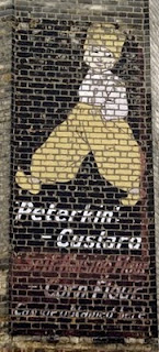
Some brands appealing more directly to those wishing to do some baking at home also used painted signs to build awareness. Rather than being found on bakers premises these can be seen in places where their products were once sold. Lee’s Century Baking Powder and Peterkin’s range of products are no more but the signs live on, the Peterkin example dating from the 1920s or 1930s.

2.5 Peterkin
The Peterkin flour Mill in Battersea was run by Joseph Arthur Rank, whose later exploits in the British film industry earned him more renown then his milling activities, which eventually failed, forcing him to return to work for his father, who was also a miller. Rank’s father continued in the milling trade and the success of his company led to the 1962 merger with two other mills, Hovis and McDougall. Rank Hovis McDougall then became RHM and was bought by Premier Foods in 2007.
2.6 Fry’s
Another powdered product, Fry’s Cocoa, also has a painted sign not far from their old factory in Bristol’s Union Street. Print advertising from around 1880 shows the factory itself being used to promote the chocolate and other cocoa goods being produced there. Fry’s were chocolate pioneers responsible for the first ever mass produced chocolate bar and also the first chocolate easter egg. The company itself started in the 1750s but this sign isn’t as old as it is positioned on the side of a house to attract the attention of those travelling by train to and from Bristol’s main Temple Meads station which only opened in the 1840s. The full text reads “Use FRY’S Pure Concentrated COCOA” in a direct instruction/appeal to those creating home-made chocolate treats.
3. Butchers, meat and meat extract
3.1 Butchers
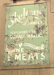
The butchers’ single most important message appears to have been assuring customers of the high standard of meat available in their establishment, ‘quality’ being used on more than one occasion among these examples. Unlike the bakers there isn’t the presence of brands emerging from the industrial centres, and this continues to be the case with meat being a food market where regions and countries rather than brands dominate the choices customers make: New Zealand lamb, Scottish beef etc.
Given the lack of influence from big producers they is a great diversity of design among the butchers signs, despite the broad consistency of the ‘quality’ message. This suggests that the signwriters employed were given far more creative freedom and this has clearly been exploited with some signs demonstrating real flair and individual style versus the more formulaic layouts and lettering employed by the bakers.


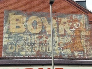
3.2 Bovril
A brand related to the butchers and their fine meats that was Bovril. First developed in the 1870s it was soon being advertised with painted signs on premises across the country. In a similar manner to the naming of Hovis, Bovril is formed from the joining of bos, latin for “ox” or “cow”, and Vrilya, a fictional substance providing energy to characters in Edward Bulwer-Lytton’s book, The Coming Race.
S H Benson, whose name eventually became part of what is today called Ogilvy Advertising, set up his business in 1893 with Bovril his first client. Within seven years it had become a national institution. The brand is well known for conveying itself as a provider of sustenance for motorists, soldiers and football supporters to name a few, perhaps a strategy devised by its fledgling advertising agency partner.

4. Tea time/coffee break
Tea and coffee drinking have long been popular activities and it’s no surprise that some of the big brands utilised hand painted advertising in communicating with the great tea drinking public. As with tobacco, tea and coffee were brought imported from the countries that were once part of the British Empire and, as a result, many of the factories and offices of the large tea producers are located around the river in the City and Southwark areas in London providing easy access to the docks and warehouses to the east.
4.1 Twinings
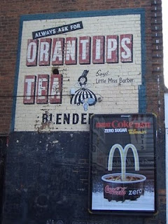
Much as Hovis dominates the signs for bread and flour, Twinings are king of the tea brands and, in particular, a series of signs located in the West Midlands. This particular series of signs in quite close proximity to each other consistently feature a character called Little Miss Barber who can be seen bounding towards the viewer holding a cup of steaming tea. Miss Barber was the front lady for a brand called Barber’s Teas which appears to have been taken over by Twinings at some point. Twinings were probably trying to save money in incorporating the new business and seem to have simply painted over the company name leaving the illustration and “fine teas and coffees” slogan in place.
Little Miss Barber can also be seen on the sign for Orantips Tea in Walsall which was either a sub brand or another company later bought by Barbers/Twinings. The historical significance of this sign was used in an application to add the building to those in Walsall’s conservation zone, although it has since been partially covered by a modern advertising board.
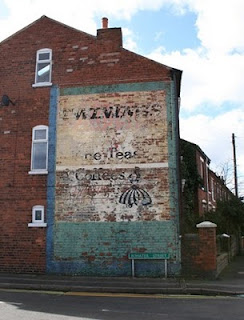
4.2 Other teas and coffees
One of Twinings’ major competitors was and is Lipton’s Tea. One difference was that Lipton’s were also a major retailer by the early 1900s providing the ideal distribution network for the company’s teas, the advertising promoting both the tea and the shop.

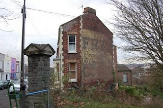
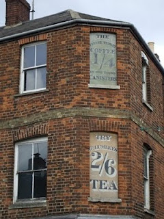
Unlike Twinings and Lipton’s it is no longer possible to find Rose Brand Fine Teas stocked on supermarket shelves. This was one of the brands found within the portfolio of James Ashby & Sons who were still trading at their Union Street address in Southwark as recently as 1980 when they filed a patent for a coffee substitute containing ingredients as diverse as barley, chicory, fig and soya. They are no longer there and, for now, their sign survives them – this building and the one with the signs for “Finest Turkey Coffee” and “George Lumleys Tea” in Oxford are both being lined up for demolition.

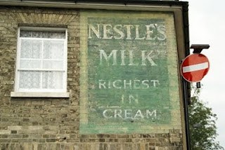
5. Milk and dairy
As with bread and tea, the milk signs are overwhelmingly dominated by one brand, Nestle’s. These appear in a wide variety of styles across the country, typically proclaiming that Nestle’s milk is “richest in cream”.

Competing with Nestle’s promotion of milk in its powdered form, dairies and distribution companies continued to advertise the real thing using hand painted signs. Dairies such as Hands (Bath) and Rax (Bridport) offered customers the opportunity to buy locally produced milk. For many in bigger towns and cities, without farms in close proximity, United Dairies ensured the efficient collection, transportation and delivery of fresh milk from farm to doorstep via rail and horse-drawn cart. United Dairies were responsible for the introduction of foil tops used to seal milk in glass bottles, colour coded to distinguish between full fat (silver), skimmed (blue and silver) and semi-skimmed (red stripes).


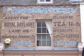
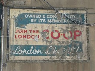
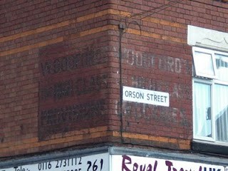
6. Groceries and provisions
In addition to the specialist food and drink outlets were shops selling groceries and other provisions of all descriptions. These weren’t affiliated to any particular brands but simply had advertising painted on the premises to attract customers into their stores. The only examples of painted advertisements for the same shop across multiple locations are those for the co-operative society. Depending on the budget of the shopkeeper the signs vary in design from the brutally simple block lettering of Woodford’s in Leicester to the beautifully crafted design for W.Chittock in Norwich.

Ends.
PS. Let me know what you thought via the comments section or get in touch.
Sam
Related Posts
-

Ghostsigns in Coventry
Last week I was invited to give a talk about ghostsigns to students at the Design & Visual Arts department of the Coventry School of Art & Design. While I was in the area I thought I’d look up any ghostsigns that I could find in the History of Advertising Trust archive, and the flickr […]
12 Nov 2014
-
Larkspur Restoration by Brian the Brush
This is the second of a series of three posts on current ghostsigns restorations in the UK, following last week’s piece on the Palladium Cinema sign in Morecambe. (See this This sign for Larkspur Soft Drinks is on King Street in Drighlington, West Yorkshire. The building it is positioned on was once home to Scott’s […]
16 Jul 2014
-
What signs say in Cambodia, a selection from Kratie
I’m planning a book to profile a collection of photos of hand painted signs that I’ve taken in my current hometown of Kratie in Cambodia. As part of this I’m working with a local called Chhay to translate the text from the signs from Khmer to English. It is proving a worthwhile exercise, both for […]
21 Jun 2012